
New Gaff - subcity.org visual design ethos
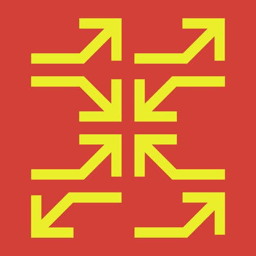
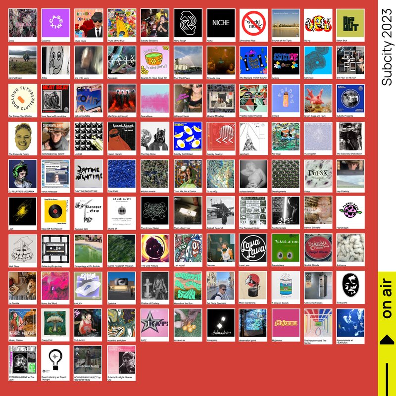
Bright and solid — Subcity enters this new home in 2023, built by a passionate team of Radio fairies. The minimalistic approach unlocks pure radio frequencies — by avoiding the fashionable abundance of digital imagery, the new website design keeps the sound waves at the focal point. Striking arrows guide the listener around, while a stack of shelves store the essential data about Subcity's community. The style was vaguely inspired by the Haçienda's visual features — its modern urbanism and "construction-site" atmosphere — in attempt to mimic the modern classic which endures decades. It was important to preserve the human aspect too, as the Station is nourished by those people involved: thus, a freeform blog section was introduced; and a full list of shows is exhibited as a wall of polaroids, featuring the visuals provided by resident DJs and radio hosts. The scrolling header line at the top celebrates the style of the early internet — by transmitting informal messages in a pure, straightforward form.
P.S. — red, as the colour of passion.

Blog post by Dominyka Sekonaite, visual design lead for subcity.org